
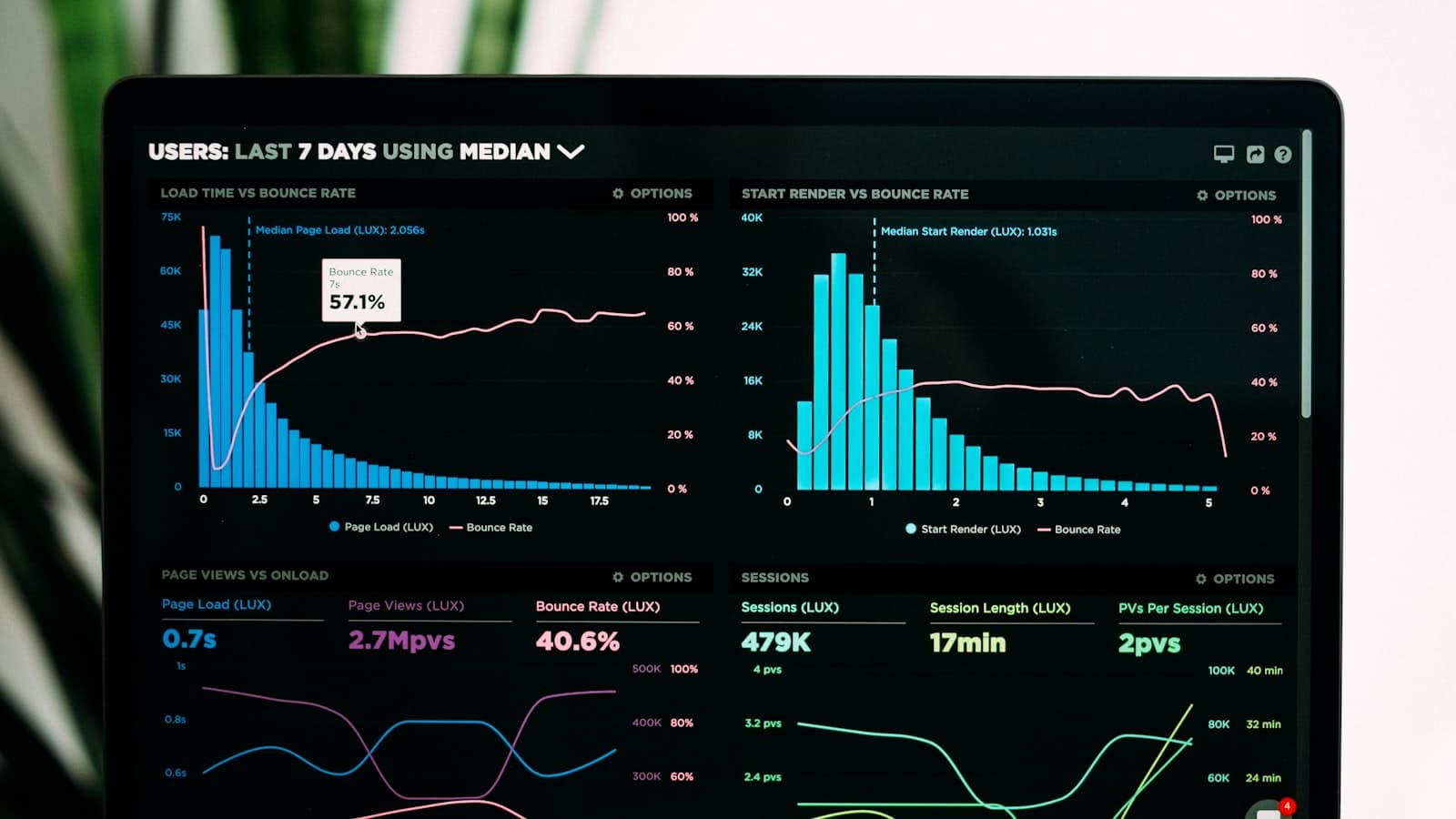
Walk into ten alternative-finance shops and you will see ten dashboards. Most of them are reporting the same five vanity numbers (funded volume, average deal size, gross yield, number of deals, NPS) at higher and higher resolution. None of those numbers, individually or together, tell you whether the portfolio you funded last quarter is performing like the one you funded the year before.
After running portfolios through multiple credit cycles, here are the analytics I look at first when I am evaluating a funder (ours, a partner's, or a potential acquisition target).
1. Vintage analysis: the foundation
Vintage analysis groups your deals by the month or quarter they were originated, then tracks the performance of each group over time as a percentage paid down, defaulted, or restructured. It is the single most important view in a lending business. Without it, you cannot answer the most basic question: is the paper we are writing today better or worse than the paper we wrote a year ago?
What a usable vintage view shows:
- Cumulative paid-down percentage by month-on-book, by origination month.
- Cumulative gross charge-off percentage by month-on-book, by origination month.
- Number of restructures or modifications by month-on-book, by origination month.
- Comparable curves overlaid so trends are visible at a glance.
If your January 2026 vintage at month-3 is charging off at 2x the rate of January 2025 at month-3, you have a problem you need to solve in March, not when full-cycle data comes in 18 months later.
2. Cohort behavior by underwriting decile and segment
Once you have vintage curves, slice them by the dimensions that actually drive behavior:
- Underwriting score decile. Your top decile should be measurably better than your bottom decile. If the curve is flat across deciles, your model isn't adding information. (More on this in our AI underwriting article.)
- Industry vertical. Restaurants, trucking, medical, retail, services. Verticals behave differently and the differences move over time.
- Source channel. Direct, broker A, broker B, platform partner X. Most funders have at least one channel that is silently subsidizing the others.
- Deal size and term. Smaller, shorter deals usually carry different risk profiles than larger, longer ones.
- Renewal vs. new. Renewals almost always outperform new deals. If yours don't, your renewal underwriting is too loose. See our servicing playbook for the renewal motion.
3. Early-warning signals on live accounts
Vintage analysis tells you what happened. Early-warning signals tell you what is about to happen. Built directly on the bank-data and payment feeds you already ingest:
- NSF day count rising month over month. Usually leads true distress by 30–60 days.
- Average daily balance trend declining or volatility increasing.
- Deposit count and frequency dropping. Often indicates a customer concentration problem or business slowdown.
- Holdback shortfall pattern (actual collected versus expected) trending negative.
- Processor changes or chargeback spikes.
- New MCA or loan debits appearing in the bank data (i.e., stacking).
The point isn't just to detect; it is to act. A well-built early-warning queue routes flagged accounts to a named servicing rep with a defined playbook: a courtesy call, a check-in on revenue, an offer to restructure proactively before the account actually fails. The full servicing motion is in our MCA servicing playbook.

4. Unit economics by channel, vertical, and product
You cannot allocate capital well without unit economics. The minimum view, computed at the deal level and rolled up by any of the dimensions above:
- Average funded amount, average factor / pricing, average term.
- Expected gross yield (modeled at origination).
- Realized gross yield (from actual collections).
- Acquisition cost (broker commission + marketing allocation + underwriting cost).
- Servicing cost per deal.
- Net charge-offs.
- Net yield = realized gross yield − acquisition − servicing − charge-offs.
This view turns most capital-allocation conversations into a math problem instead of a personality contest. If Broker A's deals net 18% and Broker B's net 6%, you are not having a strategy meeting about which one to lean into.
5. Renewal LTV: the analytic that quietly wins
Most funders look at the unit economics of an initial deal. The smart ones look at the unit economics of the merchant relationship: the first deal plus the expected value of renewals. A merchant whose first deal nets 8% but who renews twice at 14% net is a fundamentally different (and better) customer than one whose first deal nets 12% and never renews.
Build a renewal-propensity model on the dimensions that predict it (payment performance, deposit trend, industry, source) and rank your book by expected LTV, not just initial yield. Then route renewal capacity and pricing flexibility toward the high-LTV cohorts.
6. Fair-lending analytics
Beyond being a regulatory and 1071-readiness imperative, fair-lending analytics also surface real performance issues. Approval-rate and pricing disparities across applicant cohorts are sometimes legitimate (different cohorts apply with different financials) and sometimes a signal that your model is over-relying on a feature that correlates with a protected class without adding meaningful predictive power. Standing fair-lending dashboards, run quarterly with documented review, are the right approach. The regulatory picture is in our compliance guide.
7. Operations and funnel analytics
On the origination side, the right funnel view tracks: applications received → completed → priced → offered → accepted → funded, by source channel and over time. Every funder has at least one stage that is silently leaking 20%+ of qualified deals. Usually it is stip collection or signing.
8. The data layer matters more than the dashboard
A real-time, beautiful dashboard built on bad data is worse than no dashboard at all; it gives a false sense of certainty. Invest in the data layer first: a clean, normalized data warehouse with deals, payments, applications, modifications, and bank data flowing into well-defined tables; reliable batch jobs computing derived metrics on a known schedule; a single source of truth for each metric definition; and version control on the metric logic itself.
Once that's right, the visualization layer is almost free. Most modern BI tools (Looker, Metabase, Hex, Mode, Sigma, Lightdash) will produce world-class dashboards on top of a clean warehouse.
What "good" looks like in practice
If I am stepping into a new funder and want to assess their analytics maturity in 30 minutes, I look for three things: (1) Can they pull a vintage chart by origination month, on the fly? (2) Can they show me net yield by source channel, over the last 12 months? (3) Can they show me, for any active deal, the time-stamped event log and current early-warning status? If the answer to any of those is "not without a few days of work," the analytics function is immature, and the P&L almost certainly reflects it.
Our platform is built around exactly this discipline. See how we approach reporting and analytics or book a working session to compare against your current stack.
Frequently asked questions
What is the smallest analytics stack a serious funder can run on?
A managed data warehouse (Snowflake, BigQuery, Postgres), a scheduling tool (Airflow, dbt Cloud, Prefect), and a BI tool (Metabase or Looker work for small teams). The total spend is well under six figures annually for a sub-$100M book, and the ROI is large enough that this is usually the highest-priority infrastructure investment after the core platform itself.
How often should we update vintage and cohort views?
Daily, at minimum. The whole point of vintage analysis is to spot directional changes early. Anything less than daily and you are flying with a lagged instrument.
What's the most common analytics mistake you see?
Reporting average deal size, gross yield, and funded volume as the primary KPIs, with no view of cohort-adjusted performance over time. It is possible to grow funded volume and gross yield while quietly destroying net yield by widening into worse credit, and a pure-volume dashboard hides that completely.
How does this analytics work tie into capital partners?
Sophisticated capital partners (institutional debt providers, family offices, securitization buyers) diligence exactly the views described in this article. The cleaner and more credible your analytics, the better the terms you get on your line. Strong analytics directly lower your cost of capital.
Sources & further reading
- Federal Reserve Small Business Credit Survey · Federal Reserve Banks
- Office of the Comptroller of the Currency: Model Risk Management · OCC